Explain waterfall
Understand how different data points impact the prediction of your data. The explain waterfall is a helpful chart you can use in Varicent ELT whenever you have a Classifier, Regressor, or Predictor in your pipe. You can also access this chart in the following blueprints:
Customer Churn
Seller Churn
Seller Performance
Financial Advisor Turnover
Opportunity Scores
Lead Scoring
Customer Churn, Seller Churn, and Seller Performance apps. The explain waterfall can help you understand how different data points impact the prediction.
To access the explain waterfall from a pipe:
Click on the Row viewer.
Select the Classifier, Regressor, or Predict tool in your pipe.
On the row that you want to see a breakdown of the prediction, click .
On the row that you want to see a breakdown of the prediction, click .
To access the explain waterfall from an app:
From the app, select the link to view the underlying data.
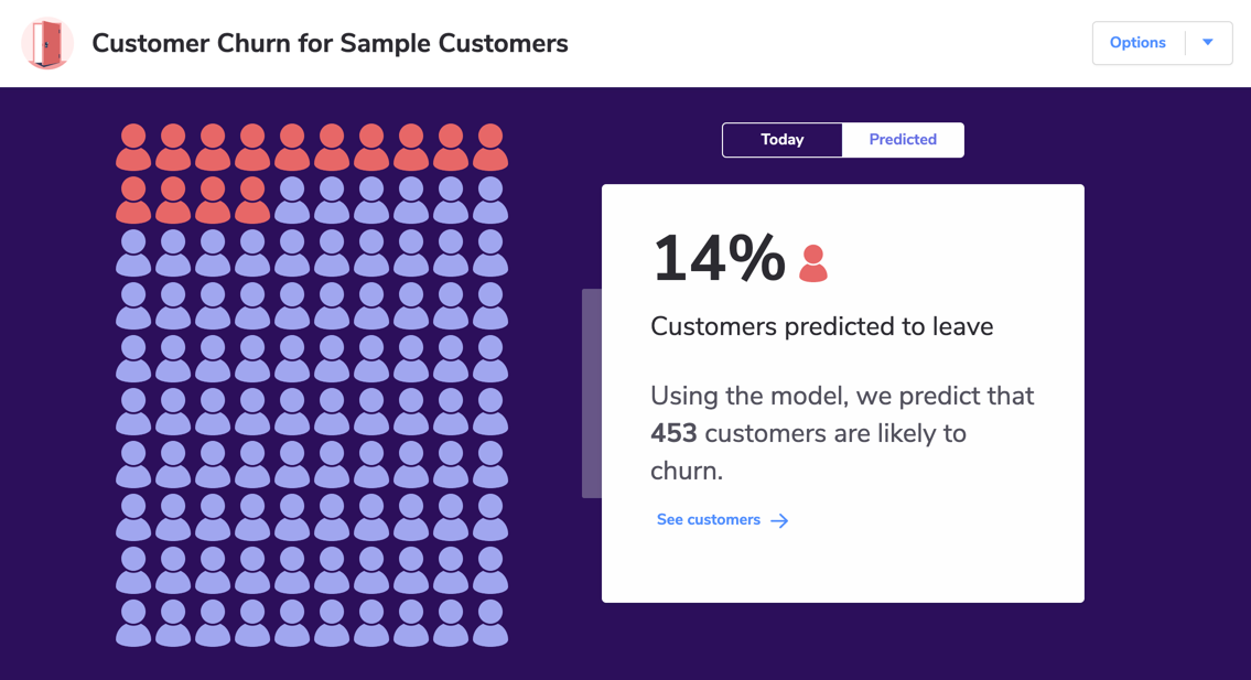
For example, in the Customer Churn app, this is the See customers link.
On the row that you want to see a breakdown of the prediction, click .
You will be taken to the tab which shows the explain waterfall chart.
How does the explain waterfall work?
The explain waterfall is a predictive model based on historic data. The Start column in every chart is the starting point for the prediction based on that historic data.
The explain waterfall should not be used to make predictions. But you can use it to help make sense of the relationship between values that are relevant in making a prediction.
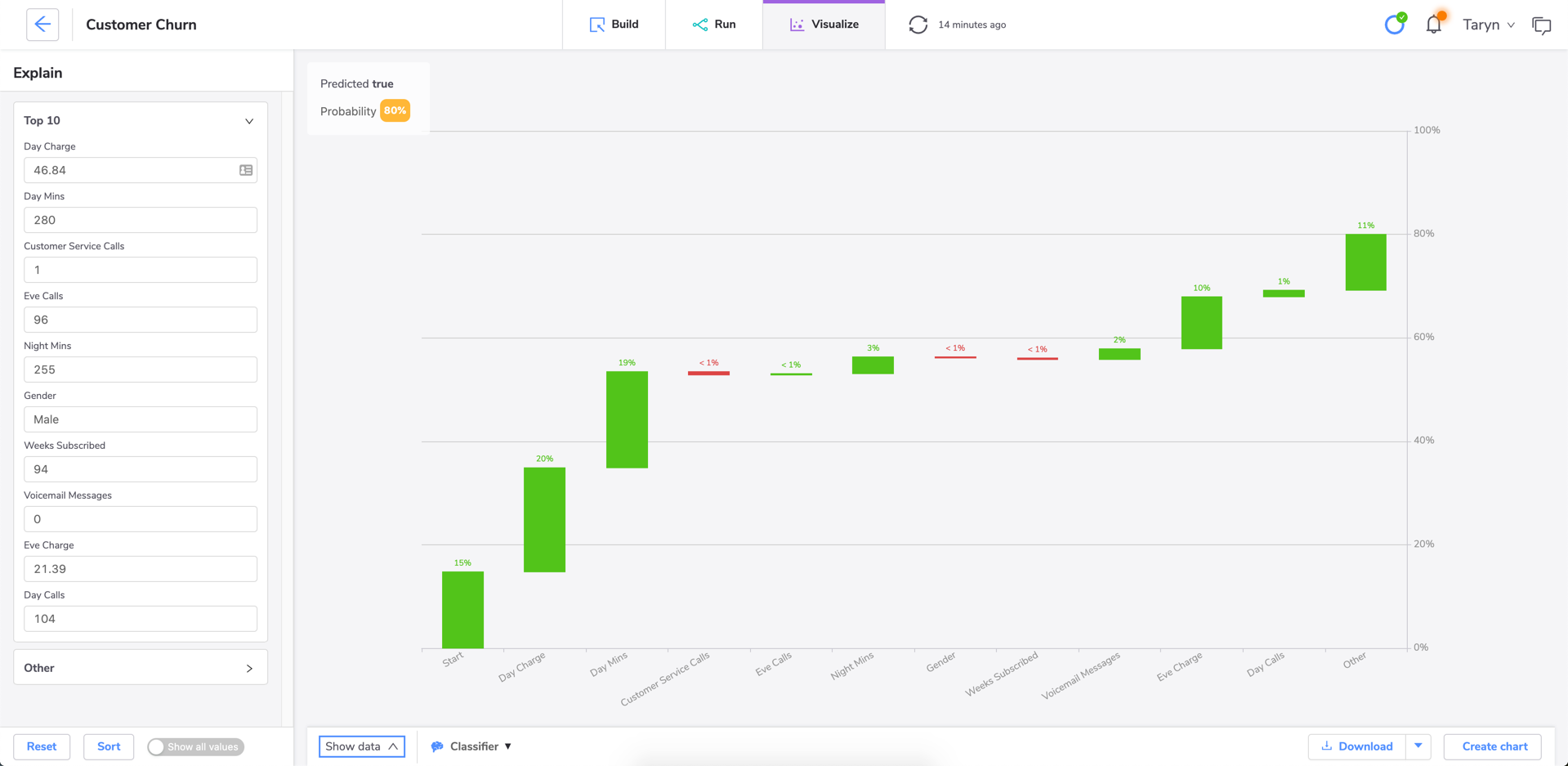
In this example, we want to predict the likelihood of a customer churning. In this case, Varicent ELT predicts an 80% probability that they will churn. The explain waterfall can help us understand that factors like the customer's Day Charge rate have a strong impact on the likelihood of the customer churning.
The green bars always show the factors that influence the predictive model towards the current prediction. The red bars represent the inverse.
Important
Case matters when predicting on text values. Use tools like the Change Case tool to clean up your data before running a prediction. If you don't, the predict tools will interpret values like "True" and "true" as two different values.