Stacked bar
Use the Stacked bar chart to show the relative value of different grouped categories or to show ranked values.
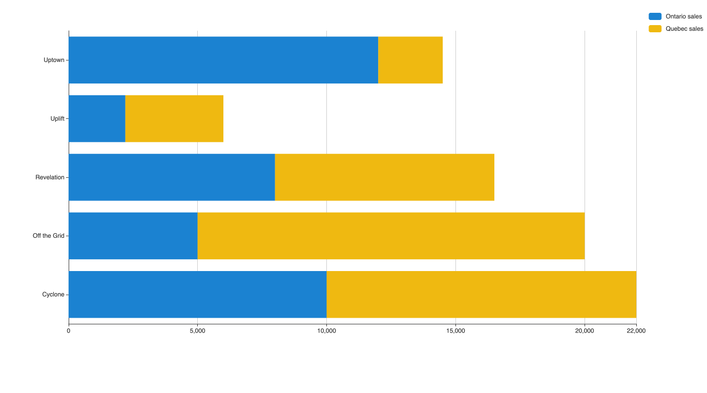
A stacked bar chart shows data represented by horizontal rectangular bars with comparative values stacked on top of each other.

The length of the rectangle is proportional to the value it represents. Each group is represented by two or more horizontal bars.
Note
If some of your categories contain negative values, use a standard bar chart instead.
Input
The Stacked column chart requires numeric columns.
Configuration
Use the following configuration options to configure the Stacked Bar chart.
Note
The Configuring the Stacked Bar chart gives configuration options through the Pipe module. If you have charts already created, you can access them through your Dashboards.
Go to the Pipes module from the side navigation bar.
From the Pipes tab, click an existing pipe to open, or create a new pipe. To create a new pipe, read the Creating a pipe documentation.
In the Pipe builder, add a data source to your pipe. For more information on adding a data source, see the Data Input tool.
Add tools to build out your pipe. For more information about adding tools to your pipe, see the Using the Pipe builder canvas documentation.
Create a chart from your pipe by clicking Charts on the canvas toolbar.
Click Create Chart.
The chart page opens.
From the configuration pane, go to the Setup tab, and select the tool that you want to create a chart for.
Note
Whatever tool you select in your pipe when you add the chart is selected by default.
Under Chart type, start typing Bar stacked to filter the list, then click on the Bar stacked graphic to select it.
Under the X axis, select a column. The X axis populates the data along the chart's horizontal axis.
Under Series, select the numeric column to use for the chart.
Expand the Advanced field, click Show to select either Preview or Last built:
Preview displays the first 100 rows of your data from your last build.
Last build displays the first 1000 rows of your entire dataset from your last build.
Under Sort, select to sort your chart data by None, Ascending or Descending.
Click Aggregate? to aggregate your chart data.
Under All, select the operation to calculate your columns with:
Sum
Count
Average
Max
Min
Median
OR
AND
STDEV
Under the selected columns, select the operation to calculate your columns with:
Sum
Count
Average
Max
Min
Median
OR
AND
STDEV
Click the Customize tab to add custom styling to your chart.
Under Chart and axis titles, select the following to add titles to your charts. To update the title from "Untitled" to something meaningful, click on the title to edit.
Include the chart title
Include chart subtitle
Include the horizontal axis title
Under Horizontal axis label angle, select the degree from the drop-down list of angles for the horizontal axis label. This option is useful if you have longer labels, as angling the text can free up more space in your chart.
Click the Include vertical axis title checkbox to add the vertical axis title.
Under Vertical axis label angle, select the degree from the drop-down list of angles for the vertical axis label.
Under Left margin, enter the padding for the left margin or click the arrows to increase or decrease the number.
Under Right margin, enter the padding for the right margin or click the arrows to increase or decrease the number.
Under Top margin, enter the padding for the left margin or click the arrows to increase or decrease the number.
Under Bottom margin, enter the padding for the left margin or click the arrows to increase or decrease the number.
Under Colour, expand the colour field, click on the column colour, and select a new colour.
Under Legend, select the Include legend checkbox to add a legend to your chart.
Click Return to pipe to go back to your pipe. To view your chart or create a dashboard for your charts, read the Dashboards documentation.
Usage example
Use the following configuration options to configure the Stacked column chart.
Each bar shows the difference in revenue between both locations for each product. However, this chart also shows the total revenue for each product.